Home Reveal | The Monroe House
We’re extremely thrilled to introduce an exciting residential design project completed this year: The Monroe House. This modern transitional new build gave us the opportunity to find innovative solutions to new challenges and provide a style that reflected the family’s story.
Designing a home is not something we take lightly! We’re always honored to be a part of a family’s journey to turning every space of their home into something they can enjoy for years to come.
These clients happened to be past furnishing clients of ours, so naturally, when they approached us to take on this project for their new, just-framed home in Illinois, we were ecstatic.
Where the Rubber Meets the Road
This was the client’s first time being part of the home-building process – throw in an out-of-state move with kids, and you’ve got a recipe for what can become a very overwhelming transition. They needed an experienced, reliable designer to help ensure their home was move-in ready when the time came. That’s where we come in!
The house had just finished the framing state, so time was of the essence – we had to hit the ground running. This is typically the time we take to get to know the client really well – learn their interests, hobbies, values – to ensure their home is a genuine reflection of their story and personality. Luckily, we already knew this client really well, so we were able to jump right in and get started with the planning.
Utilizing a Network of Professionals
The key to any successful project is creating a team atmosphere and inspiring everyone to do what they do best. Wherever the job is located, we are constantly assessing and reassessing our interior design process to streamline logistics and communication with builders, clients, and the trades to ensure we provide the client with the home they envision. Given the tight timeline for this out-of-state project, we immediately set up a call with the builder and arranged to be on site for some critical walk-throughs.
Modernizing a Traditional Exterior
The house was originally designed in more of a traditional craftsman style, and our clients prefer a modern, cleaner look, so there were some things we had to embrace from the very beginning.
One specific challenge was that the home’s windows were already ordered; the ordered window interiors and exteriors were white, and our clients would have preferred black. Most people associate white windows with more traditional homes, so our solution was to streamline the more traditional architectural details of the exterior to achieve more transitional style so our clients could bring in the cleaner more modern elements they love and have the house as whole feel cohesive.
Exploring the Modern Transitional Interior
Modernizing the exterior allowed us to push the limits on the inside of the home to a more contemporary feel. It was really important to us to be able to take this home – originally being built as a spec home – and add custom details that would add interest and serve this family in a better way than originally designed.
We were able to make several critical changes to the layout and plans that gave them a custom home suited for their family.
The Living Room
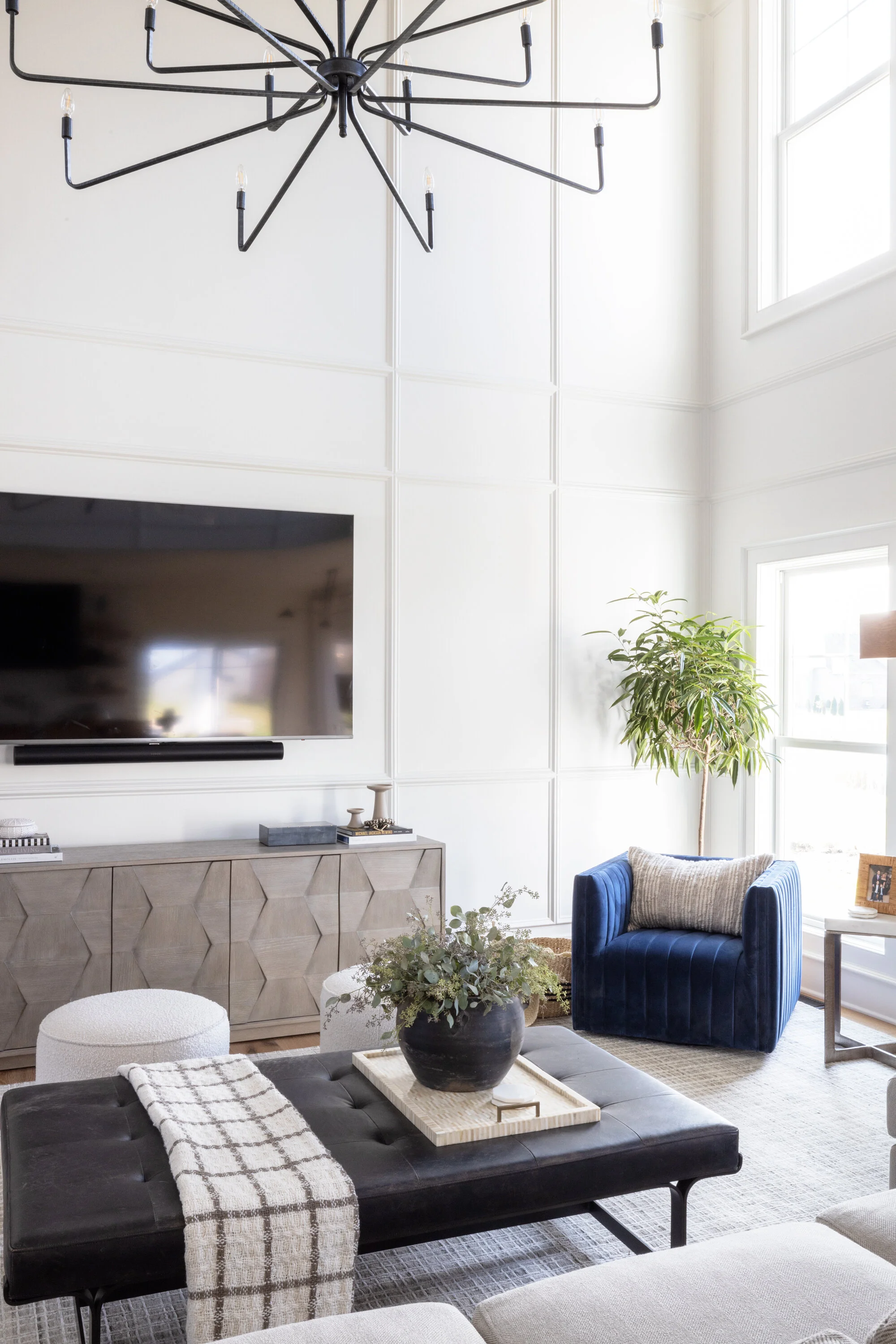
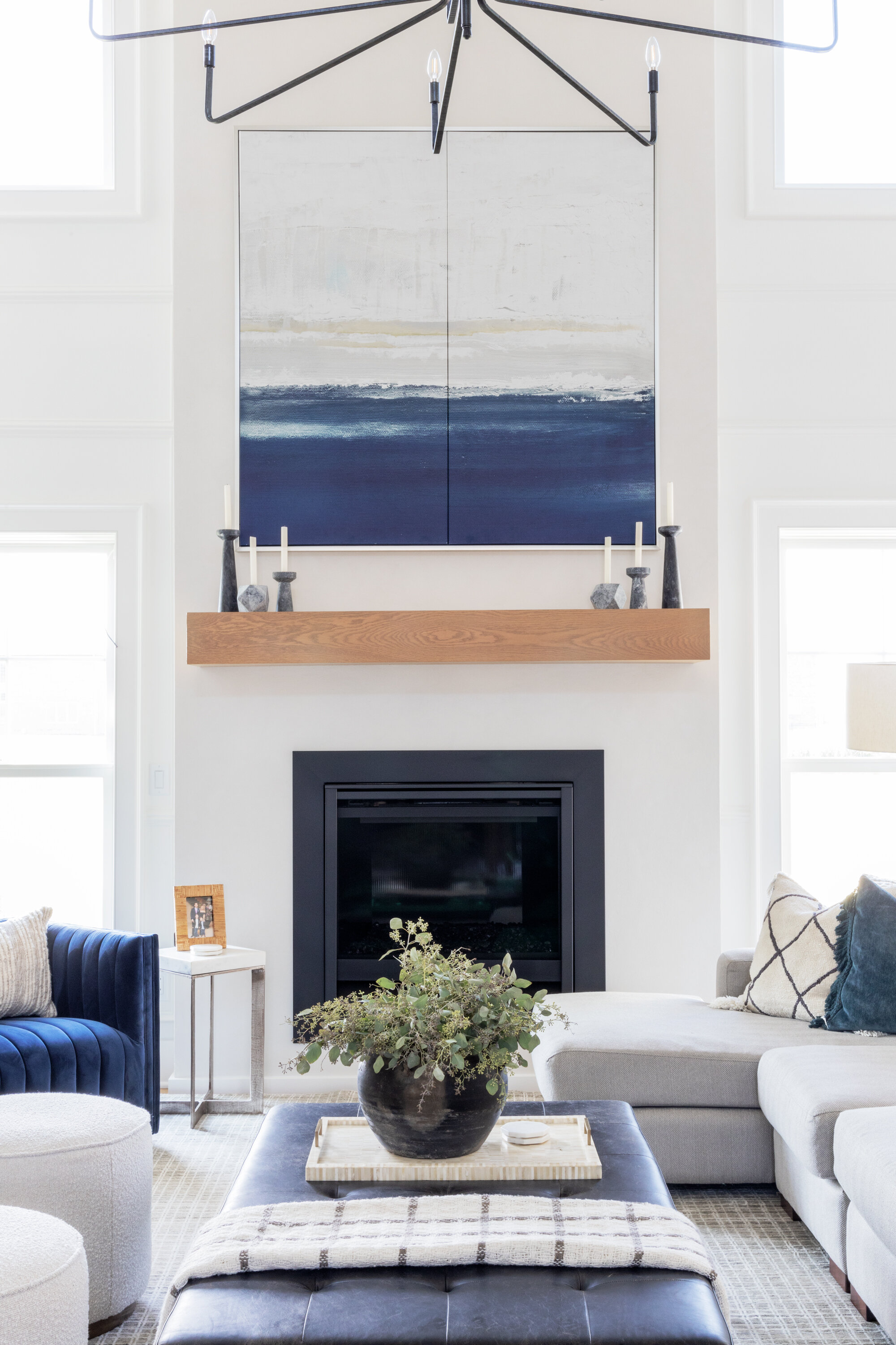
One of the challenges outside of the traditional feel of the home was the height of the living room. The 25’ ceilings could have made this room feel narrow and tall, so we added white oak beams to stretch the room and draw the eye upward. The original designs featured a small tray ceiling, which we opted to remove.
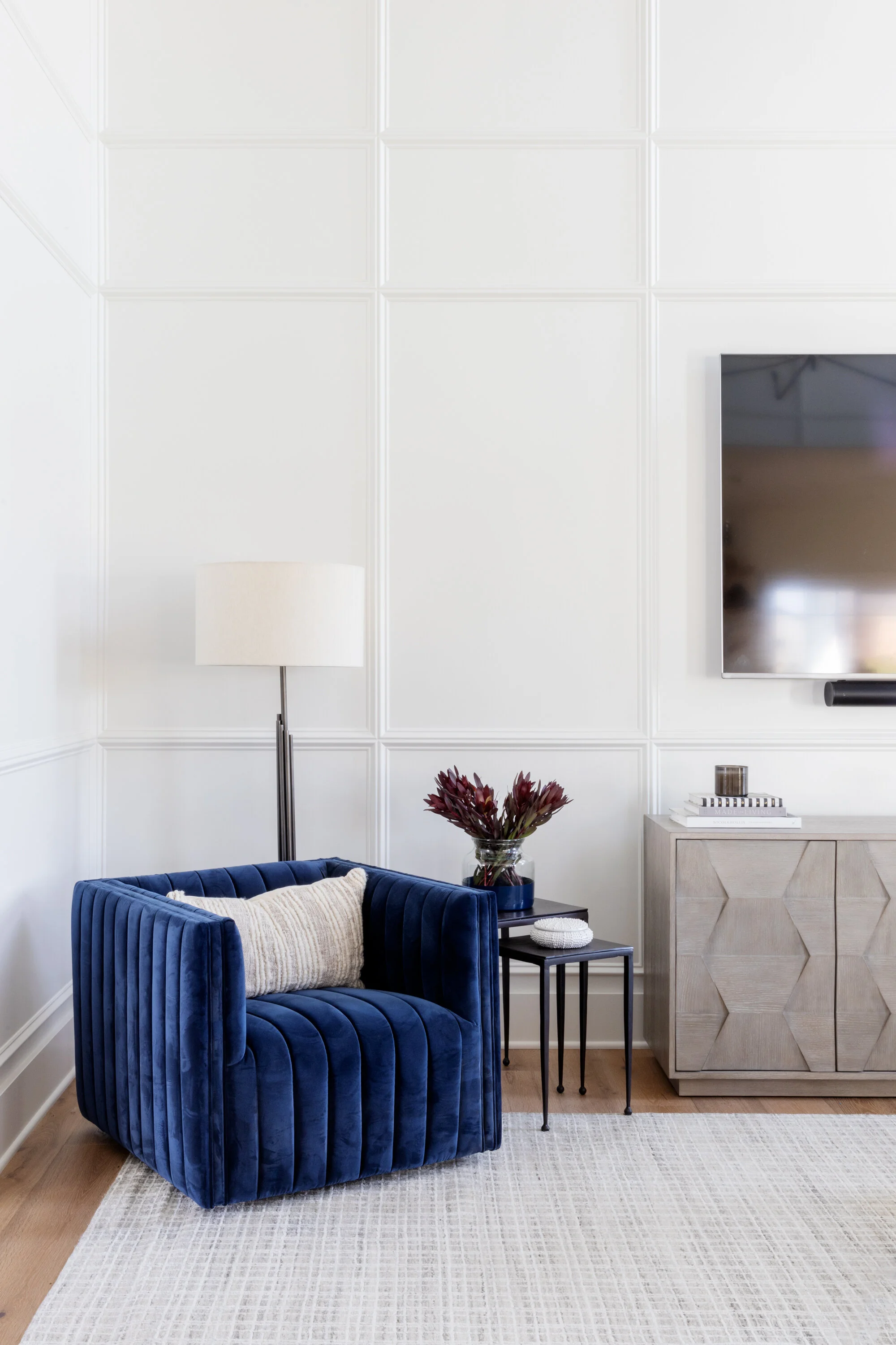
We wanted to add texture and dimension to prevent the space from falling flat and the stacked windows from feeling awkward, so we designed custom paneling to do just that. It made the room feel more cohesive and added so much interest.
It was important for the fireplace to be subtle but still unique on its own – we didn't want it to feel like an afterthought, so we went with a Roman Clay finish from Portola Paint. We used a shade that’s just a couple of shades darker than our wall color, which allows the eye to continue, therefore expanding the space. It has such a unique texture and finish!
The Kitchen
We opted to panel the fridge/freezer and ice maker to expand the kitchen and make it feel even larger. We added the waterfall edge to give them that sleeker look they love.
Finally, we went with a straight-set tile backsplash and black horizontal shiplap for the hood.
The Office
We added a beautiful built-in to the office and some unique doors. Opposite the office is the dining room, where we used a black grasscloth wallpaper.
The Primary En-Suite
We started with the beautiful black and white abstract tile on the primary bath floor, which really set the stage for everything else we wanted to feature in this space. We paired it with large minimalist modern mirrors and sconces to keep it feeling really clean and beautiful, keeping the attention on the floors.
The Bar
We had a lot of fun with the dark cabinets and walls in the basement – since this space is meant to entertain, we wanted to give it a little more mood than the rest of the house.
The Laundry Room
The laundry room was another place where we got to have a little fun with the design. We fell in love with an irregular patterned tile floor that would let us do just that, hopefully adding some fun to those more mundane tasks like laundry and cleaning.
The Hallway/Mud Area
We turned an open bench in the hallway into a closed cabinet, hiding cubbies with plenty of storage and outlets for charging small electronics.
Another Successful Project in the Books
Taking on a project like this for a home that was already framed on an expedited timeline provided us some amazing opportunities to do some outside-the-box thinking. We really enjoyed exploring all of the possibilities and finding creative solutions to establish a cohesive modern transitional style for the home, inside and out.
We especially love working with clients and problem-solving to find the perfect solutions to ensure that a home reflects their true style and personality. It should be a reflection of them and their story. It’s such an honor to provide something so personal by creating a beautiful home that will serve as a backdrop for the memories they’ll make in the years ahead.
Credits
Mark Hall Cabinetry
Cabinetry
Jim Walder
Builder
Emily Sewell
Photography


