Office Reveal | Modern Office Makeover
Feminine and funky, playful and on-trend — these are just a few words to describe this commercial office renovation project. This fresh office design space makes a statement with a combination of a bold color palette and engaging patterns and clean lines. Introducing Hoot Design Company’s modern office makeover!
Upward & Onward
Hoot Design Company, a quickly growing brand-building agency in Columbia, MO, operated within an amazing downtown office space they shared with another company, but they soon became aware that their rapid growth meant it was time for them to find a larger office space they could have all to themselves.
Having previously done their downtown office remodel, we were thrilled when they came to us again in October of 2020 to launch an interior design vision that would take their one-room suite to a two-level building.
Kristen Brown, founder of HDCo., wanted a multi-functional space that reflected her company’s fun spirit and honest values, an environment where she and her team could continue to grow and thrive. With a modern and bold vision in mind, she bought a building and came to us to help bring it to life.
Creating a Warm Welcome
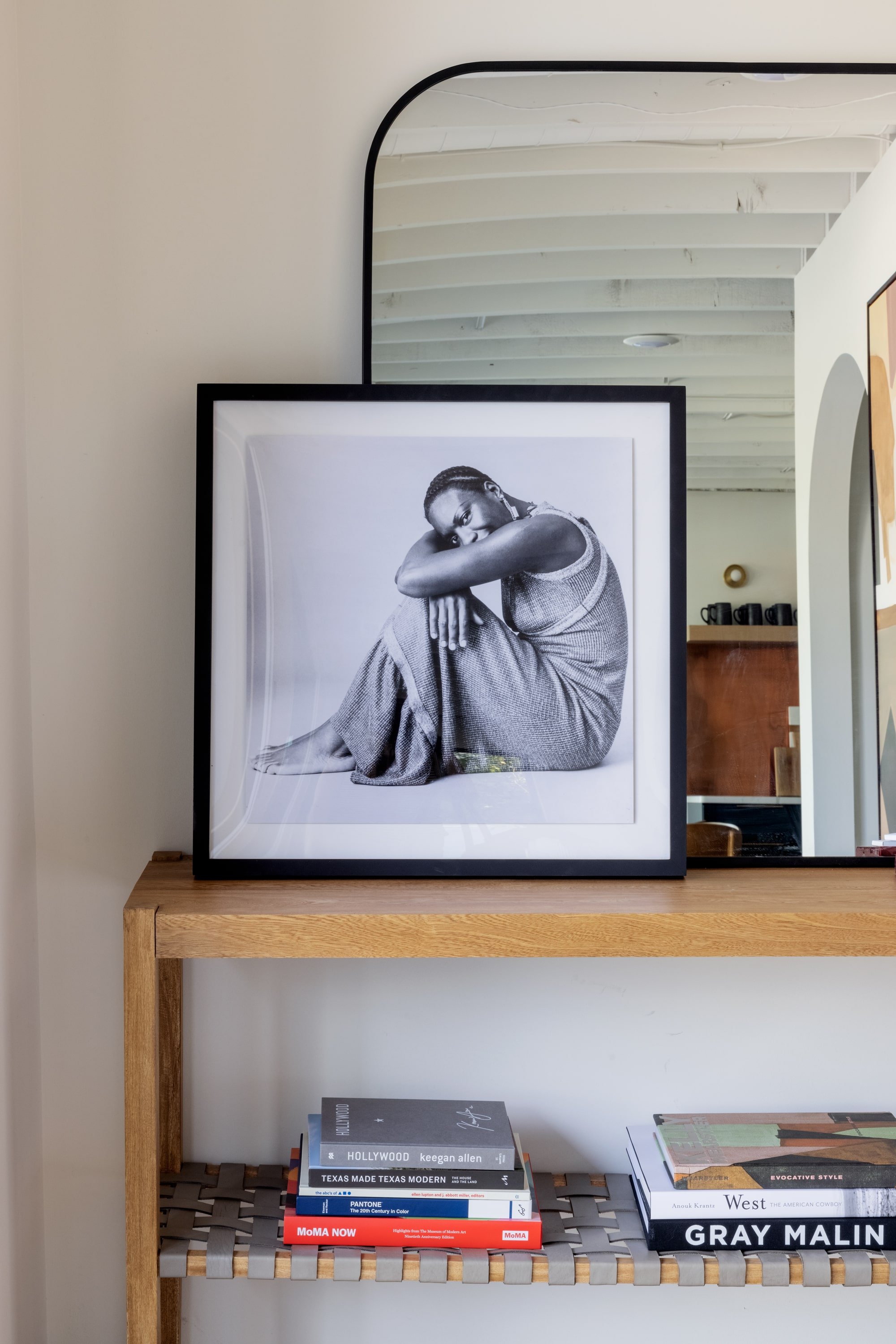
As soon as you enter the lobby, you’re met with warm and bold contrasting colors, engaging patterns, and inviting textures. The entrance acts as a receiving area for clients as well as a mail drop, so we added the Four Hands Jacobo Console Table from Scout & Nimble to showcase the team’s branding materials, favorite art pieces, and books as well as collect mail and small parcels.
Shop the Look: Jacobo Console Table, Alice Cream / Charcoal Rug
Shop the Look: Nina Simone by Getty Images, Ukan Mirror
Shop the Look: Zemora Vase
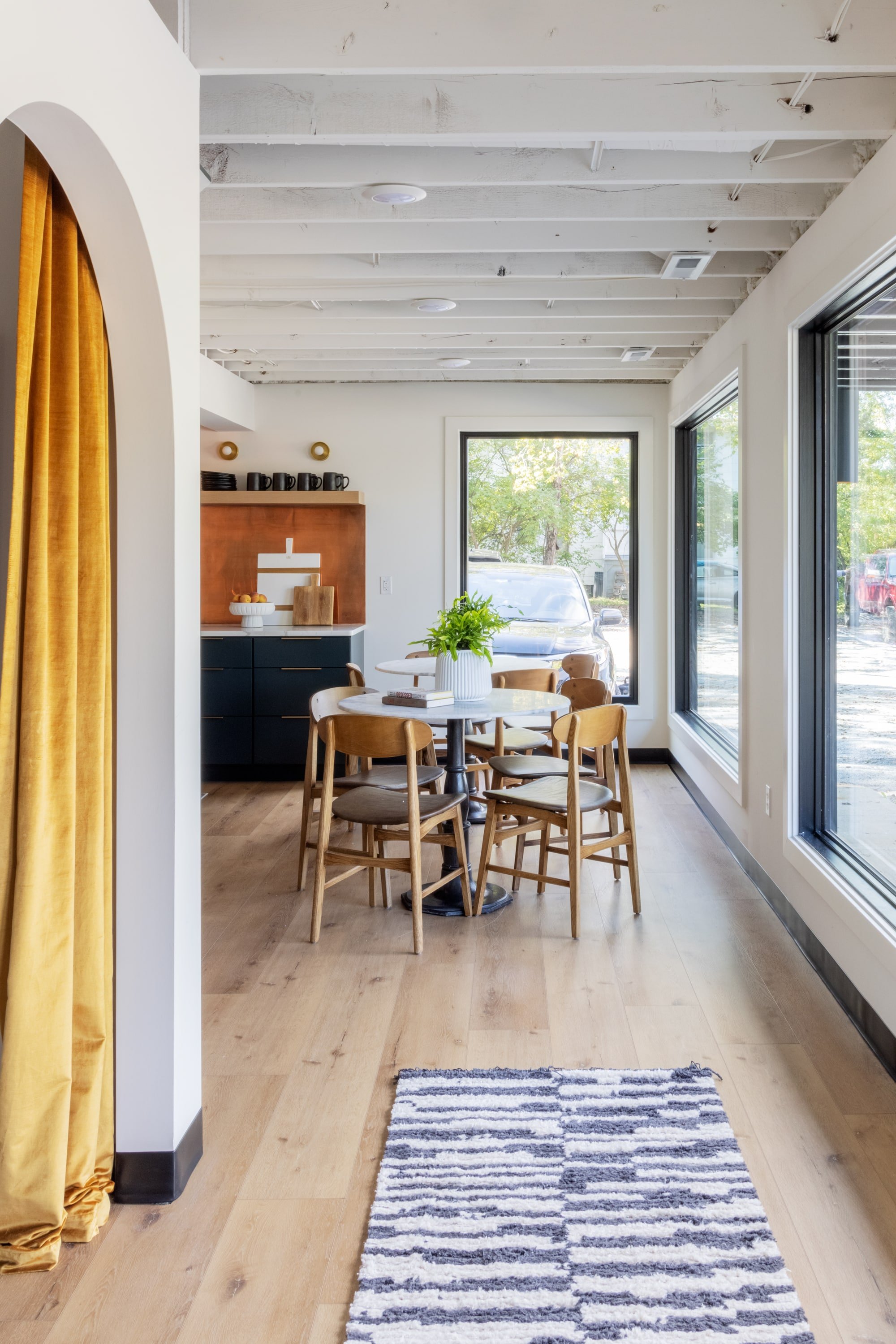
One of the most important things for the HDCo. team was to have some separation between the lobby entrance and the work area, so we built a partition wall to add privacy and separate the lobby from the bathrooms, the offices, and kitchen area. We opted for two arched openings to not only make a visual statement, but to also give easy access to the team to get back to the working areas.
Making a Space to Gather
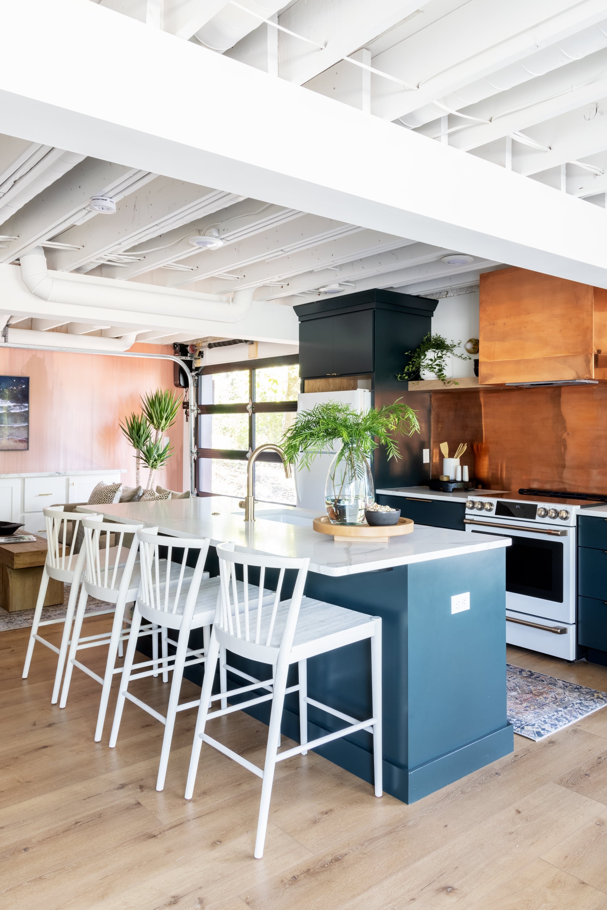
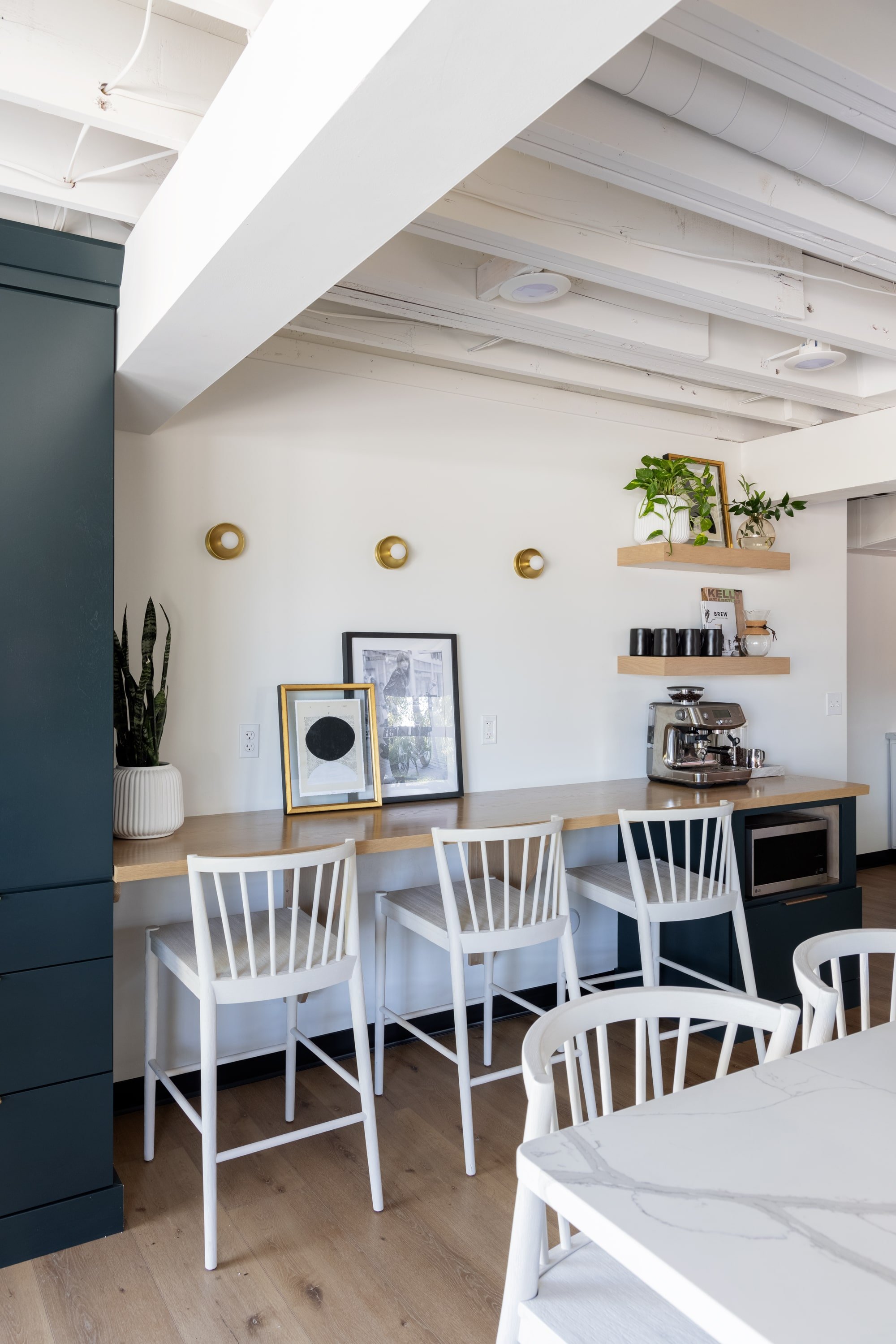
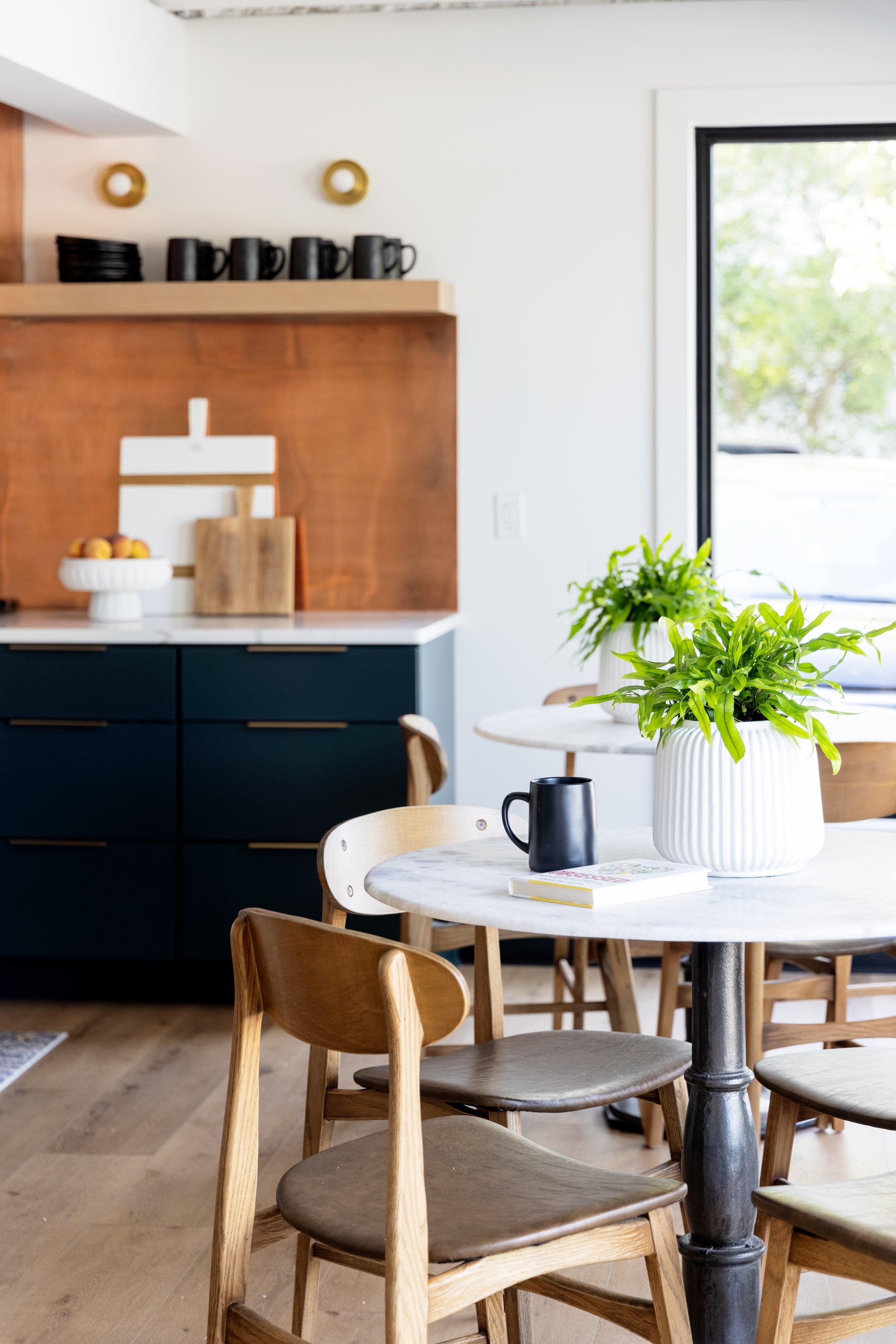
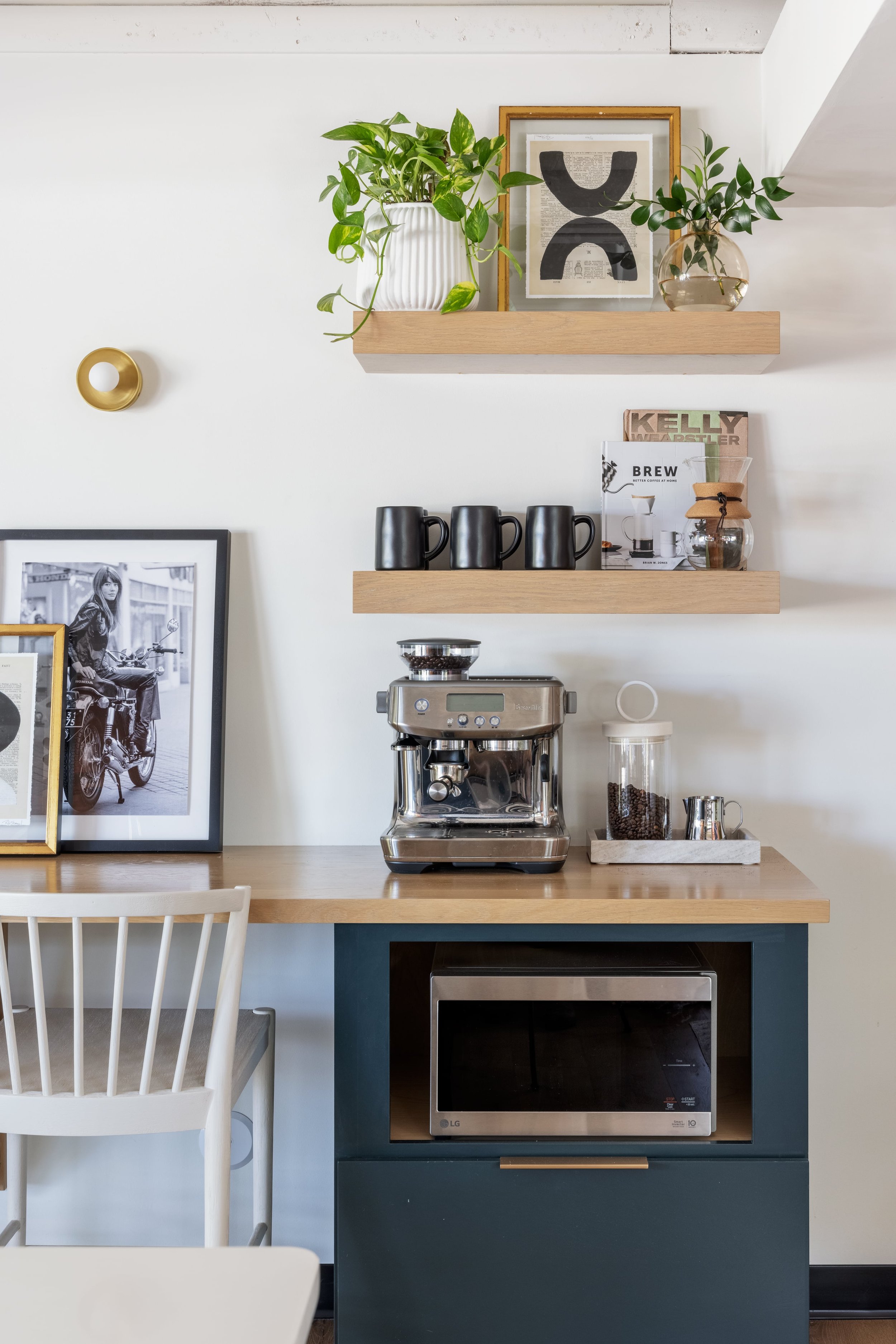
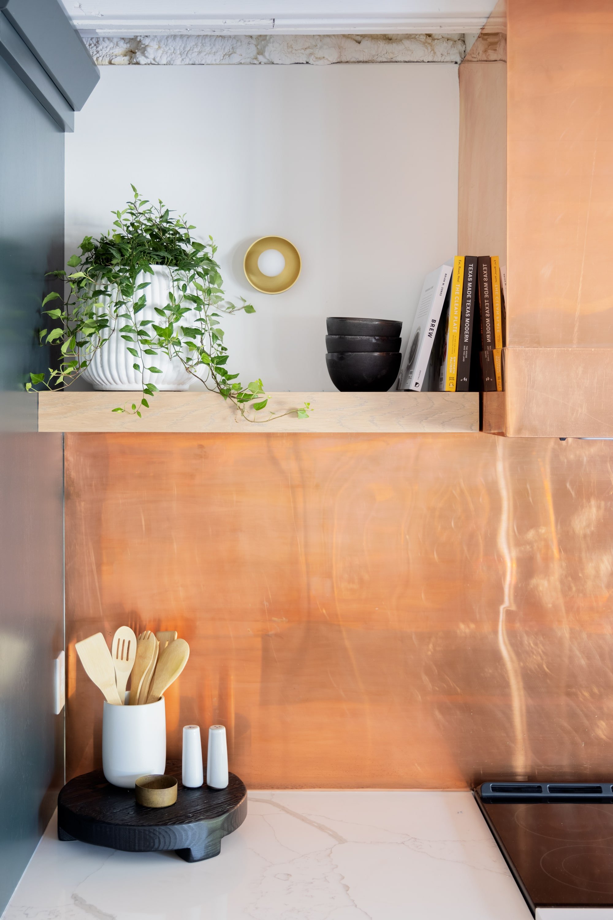
The kitchen is hands-down one of our favorite spaces in the new office. With a custom copper backsplash, moody green cabinets for tons of storage, a large island, a fully stocked coffee/snack bar – even a garage door for outdoor entertaining – this kitchen has got it all!
Not only is the kitchen the gathering space for meals, it also serves as a lounge area that allows employees to spread out and change up their work environment. And what better place to get those creative juices flowing than in the kitchen?
Shop the Look: Julien 1 Light Bath Bracket, Milan Stool
Shop the Look: Natural Nesting Lazy Susan, Medium, Artisanal Vase, Milan Stool
The coffee bar and island provide plenty of outlets for laptop use, and the kitchen area fits two tables and eight chairs for eating. The team already owned one of the tables and four chairs from their downtown office remodel, so we added another set to give them plenty of room for current team members and new members they add in the future.
Shop the Look: Lucy Bistro Table, Adrien Cachepot
Shop the Look: Inanimate Object VII, Julien 1-Light Bath Bracket
Back to this breathtaking custom copper backsplash… (Seriously, we can’t get enough!)
Shop the Look: Brasserie Round Trivet, Cleo Sale & Pepper Shakers, Small Polished Brass Bowl
Lounging in Style
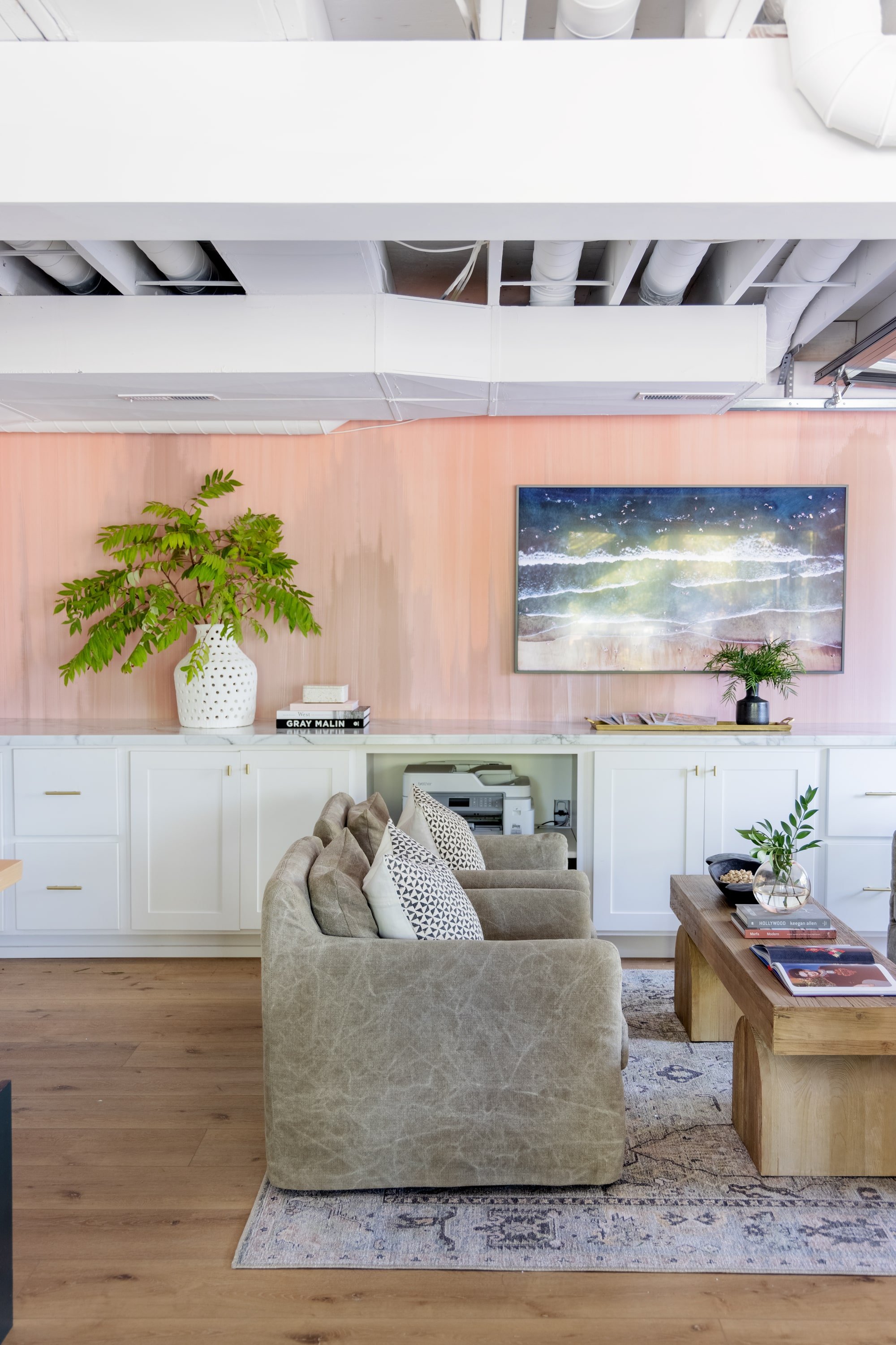
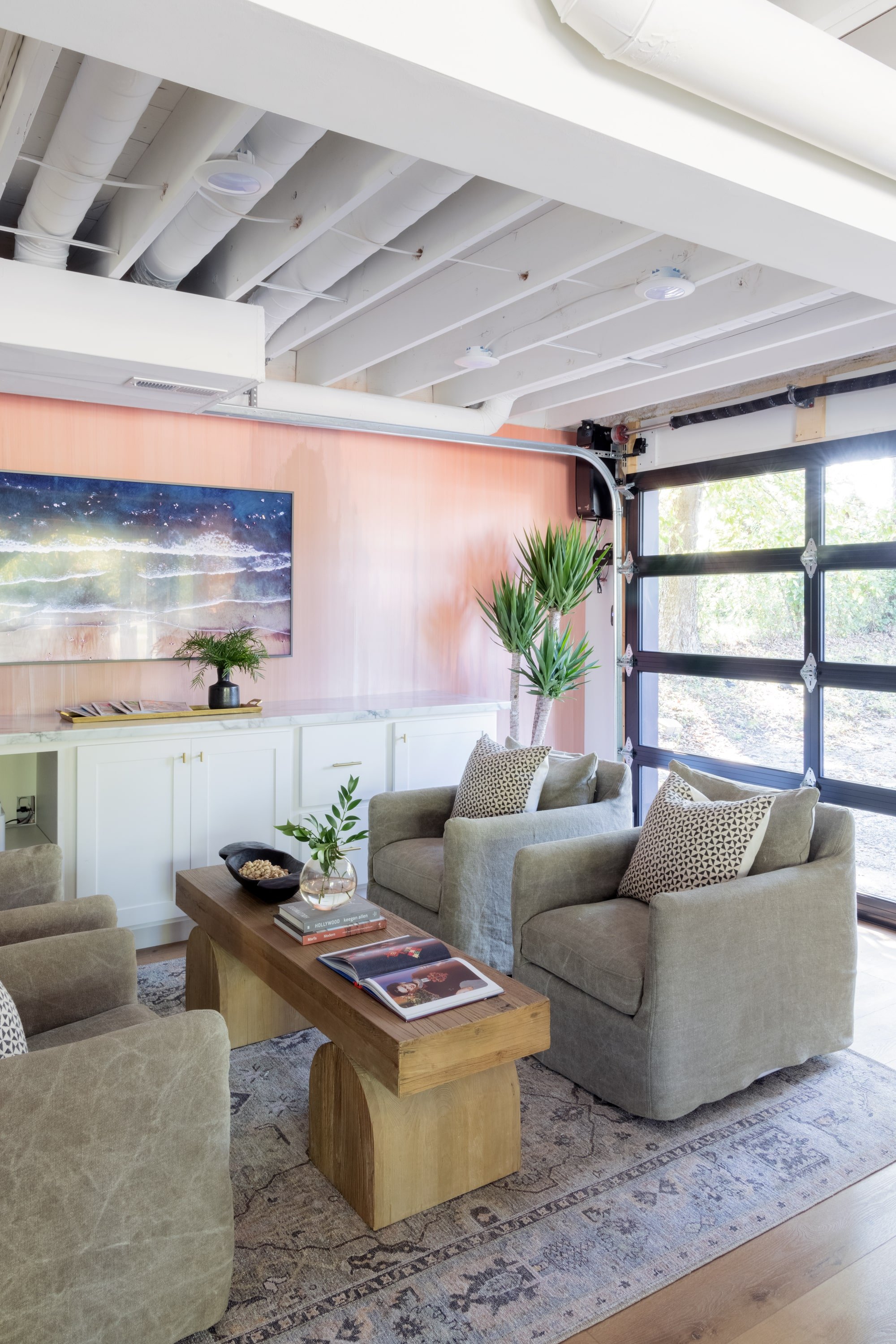
For a cozier workplace or to meet with other team members, employees can head into to the lounge area just off of the kitchen. There, they can work while taking advantage of one of the comfy swivel chairs and the frame TV for collaborating or just the ambiance of the soothing photo slideshow that plays between uses.
We’re such a big fan of versatility with pieces, which is why we just love the look of the Keane bench from Scout & Nimble here as a small coffee table.
Shop the Look: Keane Bench, Belly Vase
Shop the Look: Amelia Brass Tray, Mika Bottle Vase
Speaking of ambiance, nature is spilling into this room through the sleek black-window garage door, which they can open on a beautiful day to invite more nature in or to expand their hosting space for indoor/outdoor events.
Shop the Look: Keane Bench, Banks Swivel Chair Stonewash Heavy Jt Tp
Shop the Look: Janya Black / White Pillow, Avin Oriental Green/ Blue Rug
Setting the Main Stage
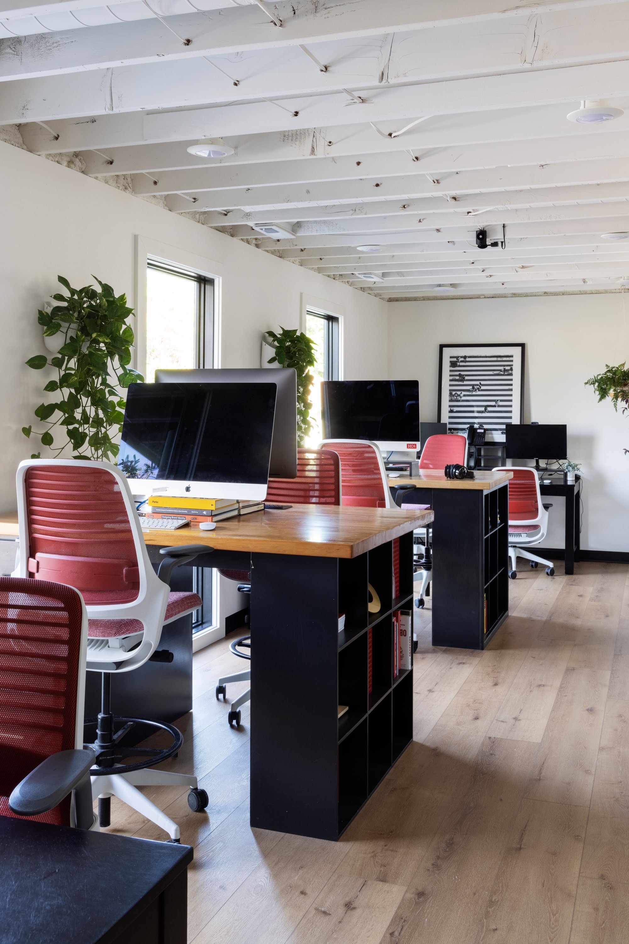
For the team’s individual workspaces, they wanted both an open, collaborative space for the creative side as well as a more private, closed-off area where the account team could focus.
We were able to repurpose the desks and chairs from the old office in this open, collaborative area, or the creative bay. The employees are able to enjoy the daylight pouring in from floor-to-ceiling windows, which was something Kristen was initially wanting to take advantage of for the conference room but felt her team should benefit from this lovely feature rather than the occasional client. We worked out a solution that pleased everyone, but we’ll get to that a bit later…
Shop the Look: Javari Charcoal / Silver Rug
Shop the Look: Hawkins Dining Chair, Happy Floor Lamp
To provide the account team with a distraction-free zone, we designed a partitioned area that features custom-built glass and wood dividers and corner seating that allows for collaboration. We love when beauty and function align so well.
Congregating with Clients
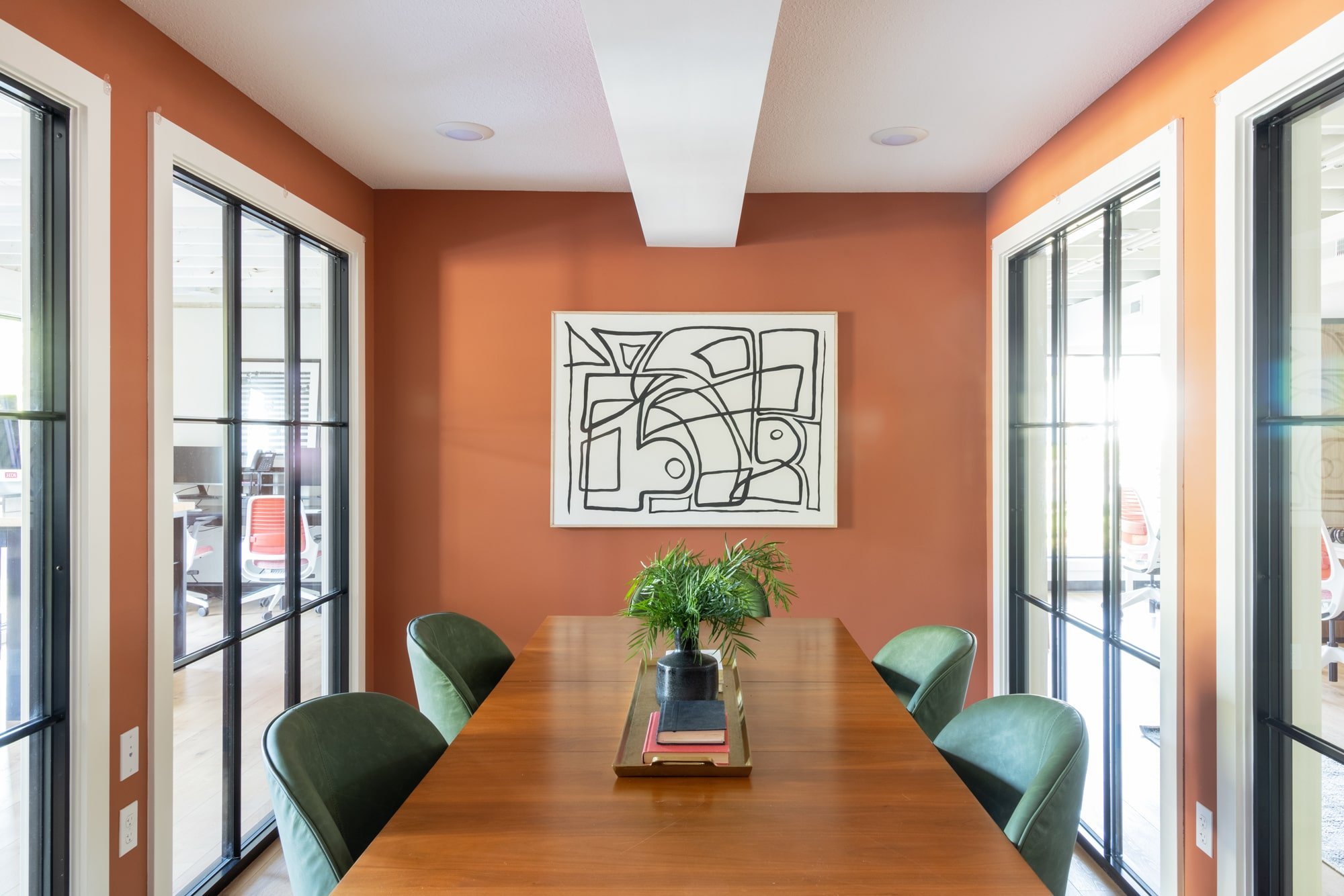
HDCo. wanted more freedom for hosting multiple meetings at the same time, so they were hoping for a conference room that was visually closed off for privacy.
Kristen initially considered using the account bay area as a conference room so clients could enjoy the natural lighting from the floor-to-ceiling windows. She decided her team should benefit from this feature, so to bridge these concepts together, we installed floor-to-ceiling windows around the entire conference room, which is situated in the middle of the office space between the creative bay and the account bay.
Shop the Look: Stark 1 By Dan Hobday, Aubree Dining Chair, Amelia Brass Tray, Mika Bottle Vase
Now, the team members and clients can all enjoy the natural light! And to account for that “visually closed-off” want of Kristen’s, they’ll soon be installing curtains, which will add even more versatility and value to the space.
Podcasting in Style
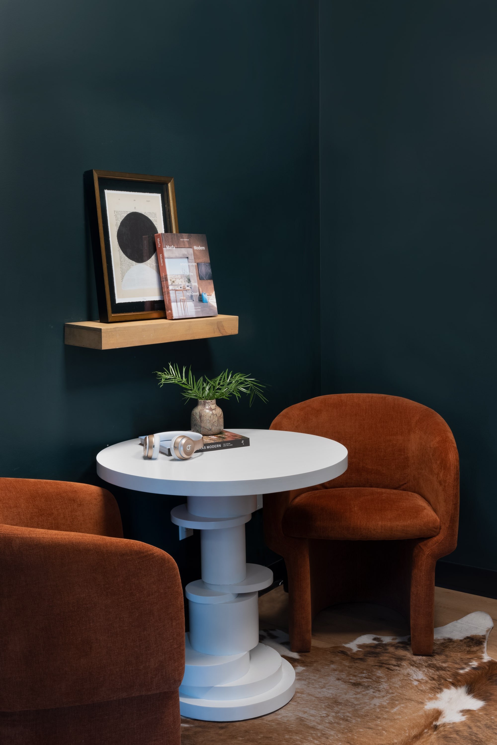
First off, we just can’t get over this podcast room. It’s intimate and soothing yet slightly moody all at once, thanks to the reappearance of that deep Salamander green we used for the cabinets in the kitchen and the warmth and softness of the orange Clementine oversized chairs.
Shop the Look: Hugo Side Table, Clementine Chair, Cypress Marble Vase
This semi-soundproof room was one of Kristen’s needs in this new office for a space where she could record her podcast series, Profresh. This space also serves as a private area making personal phone calls or having one-on-one conversations.
And how fun is this Hugo Side Table? It adds so much interest!
Gender-Neutral Restrooms
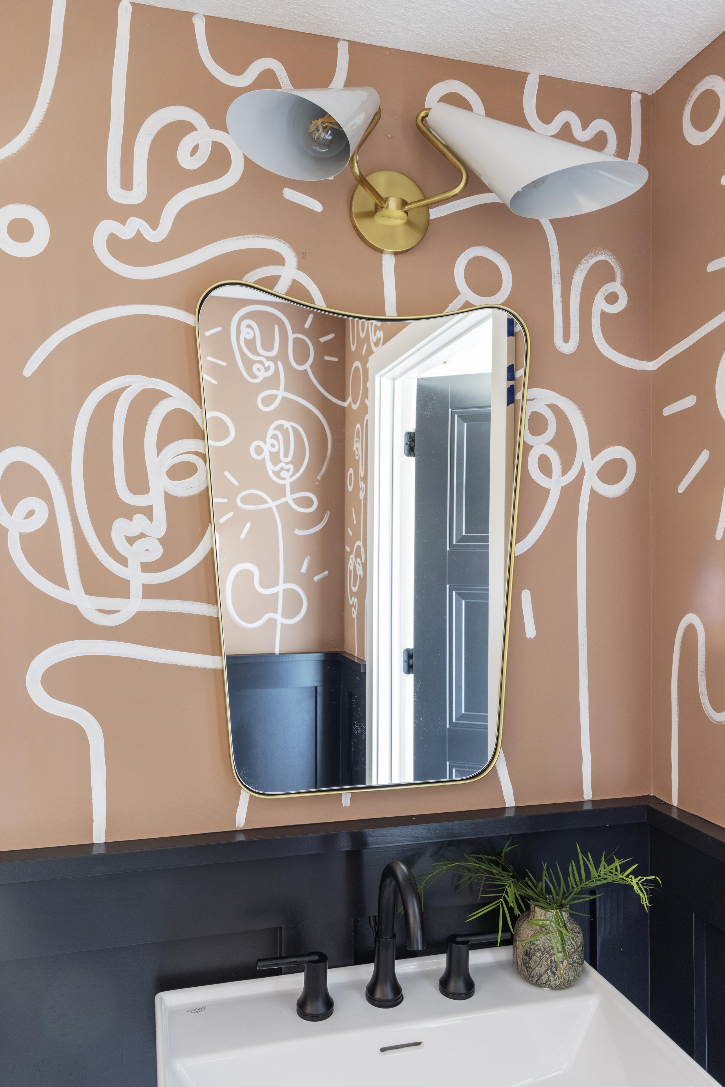
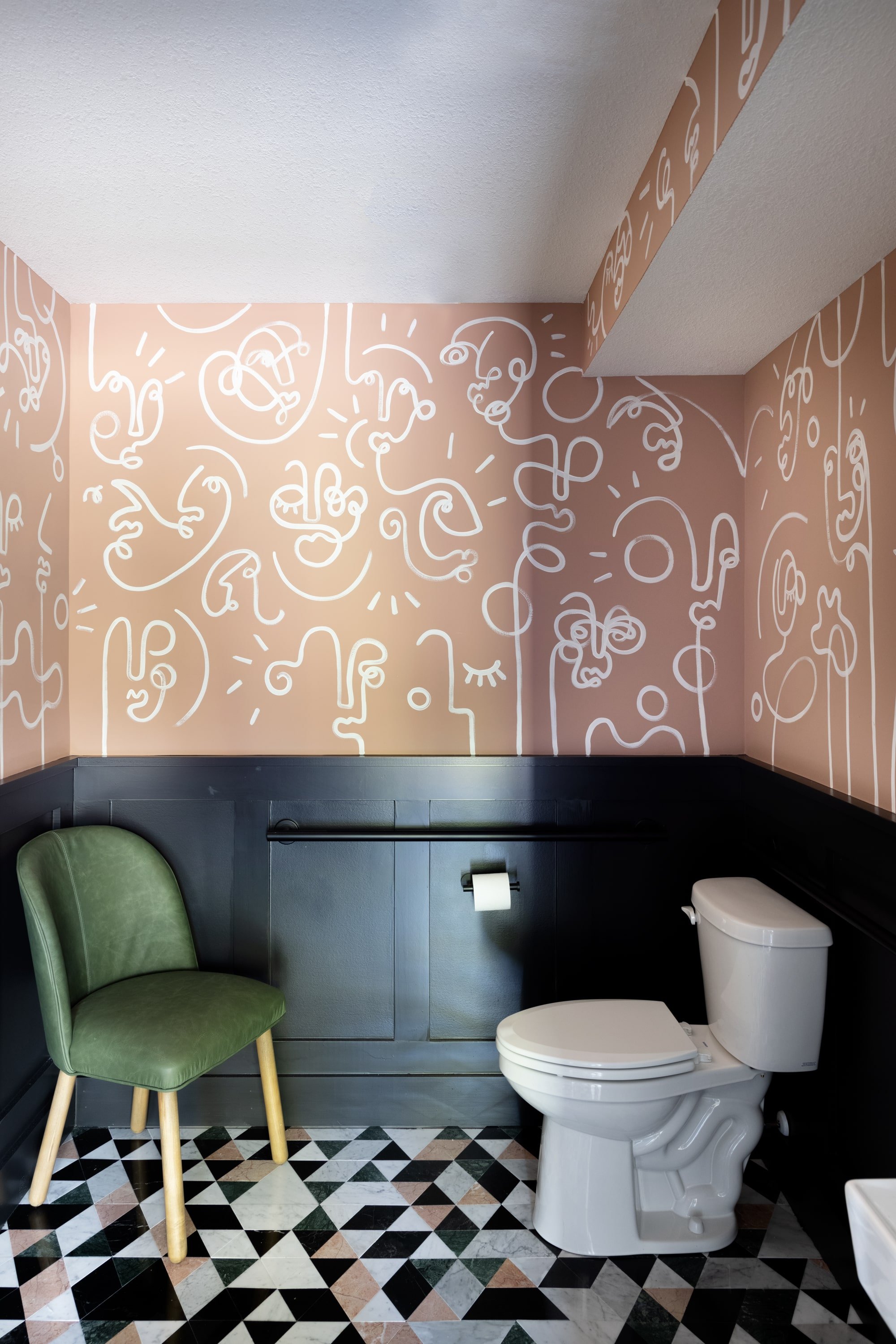
When we said we didn’t hold back on this project, we meant it! This wildly fun wall art in the gender-neutral restrooms is further proof of that.
Shop the Look: Talia Two Light Wall Sconce, Tufa Mirror
Shop the Look: Aubree Dining Chair
We commissioned a wonderful local artist, Adrienne Luther, to lend her incredible talent by hand painting these abstract murals on the walls. The mosaic marble floors add even more of a graphic statement. A small space like a bathroom is the perfect place to do something bold and unexpected and love how this space came together.
A Place to Hang Their Hats
In the hallway that extends from the lounge off the kitchen, we added some simple gold hooks for hats and coats to provide for another one of Kristen’s wants for this new office — proof that the simplest things can make all the difference!
Shop the Look: Keane Bench, Artisanal Vase
Overcoming Obstacles
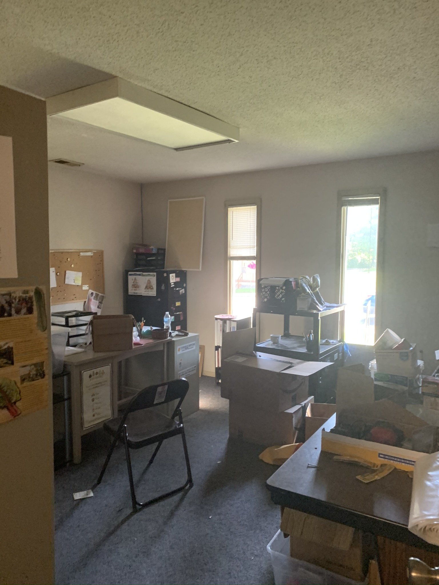
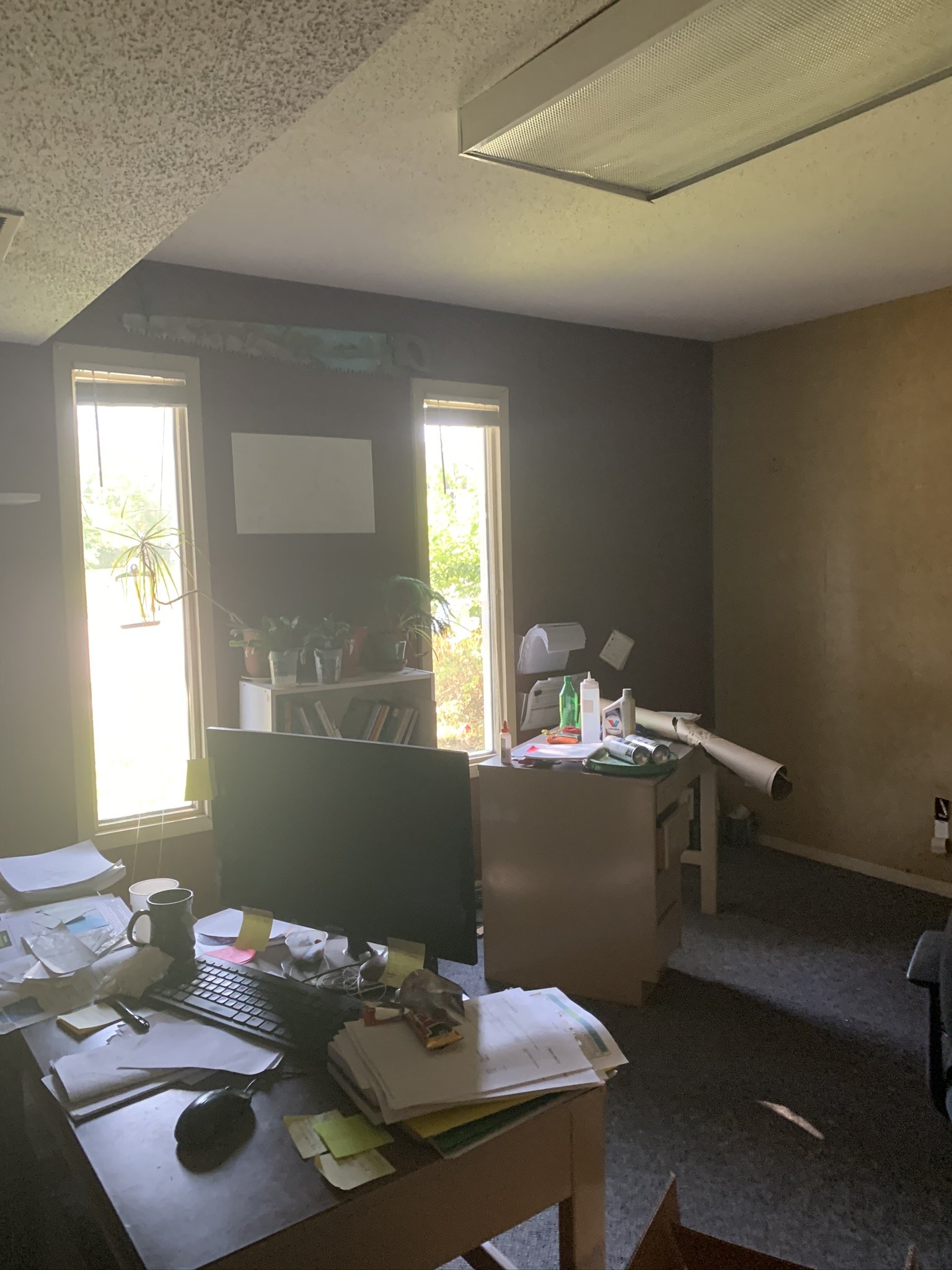
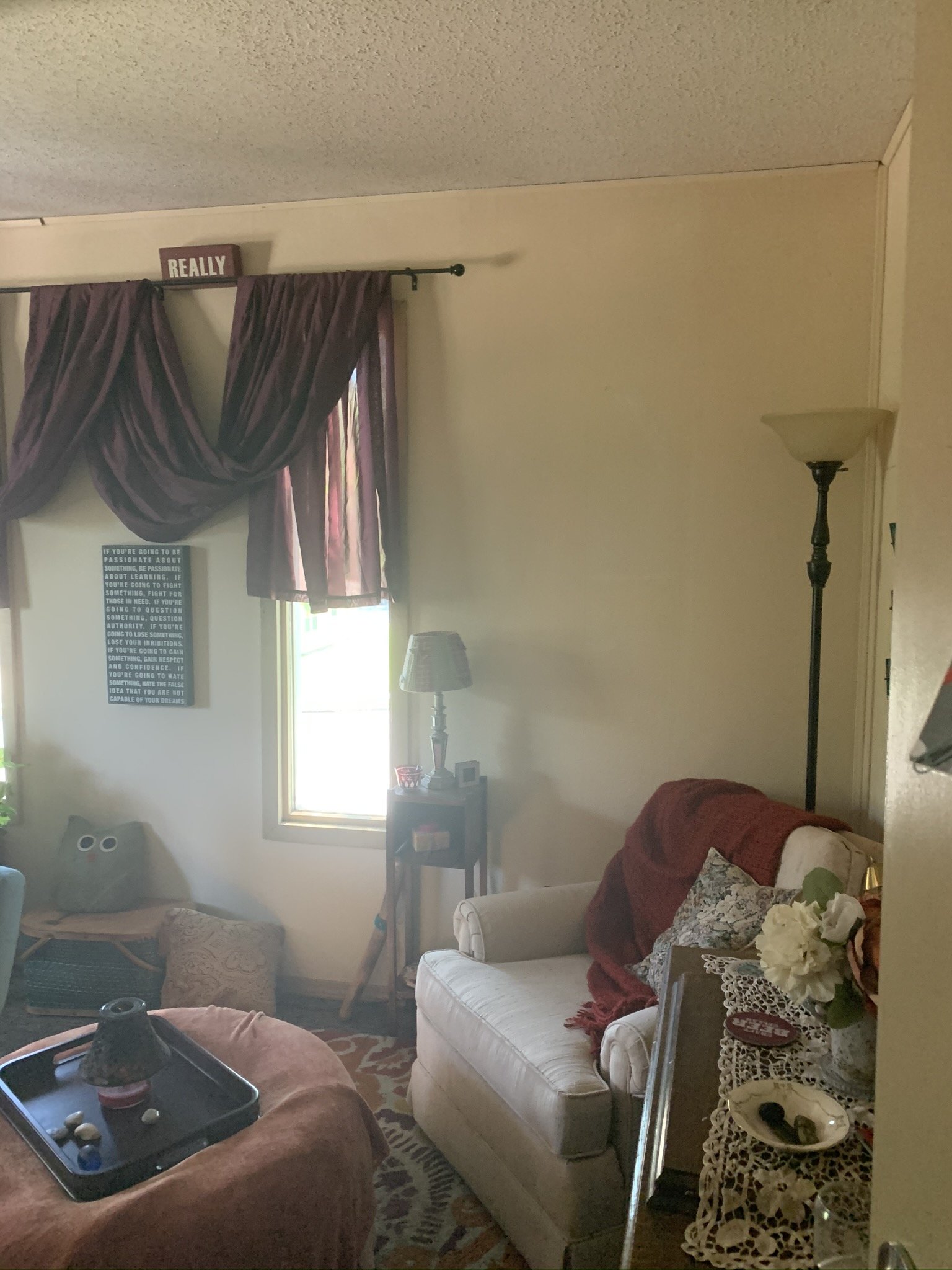
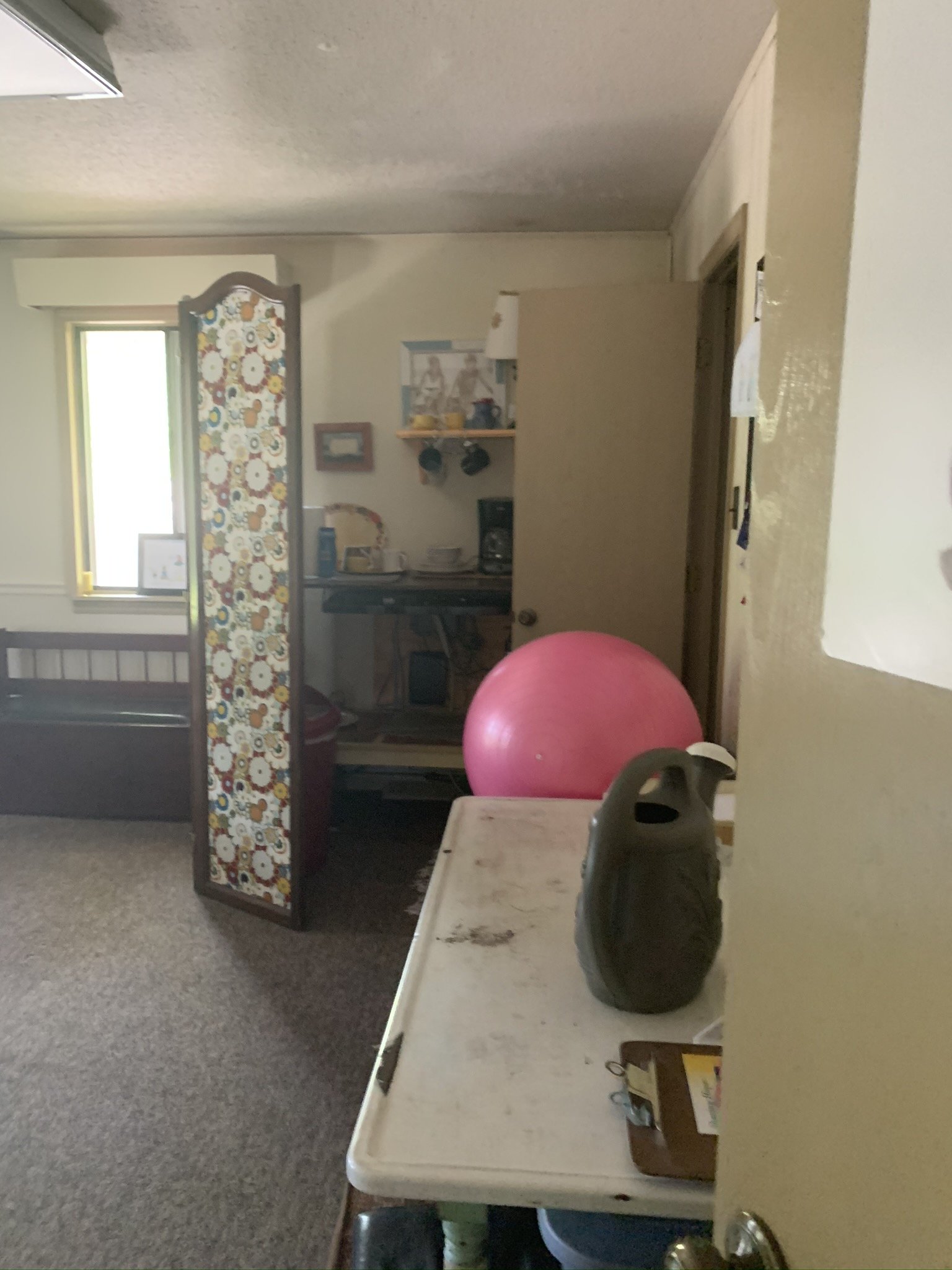
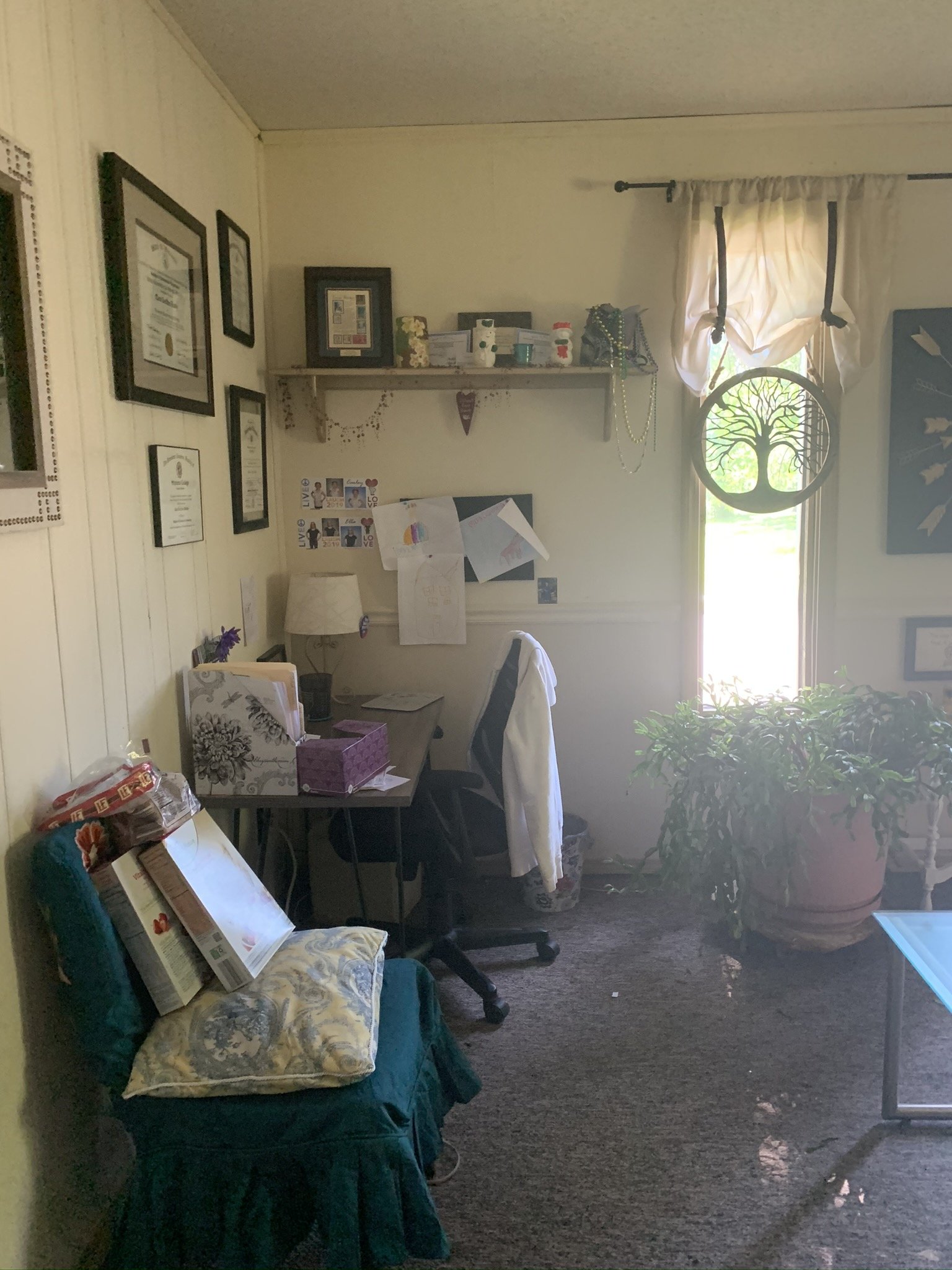
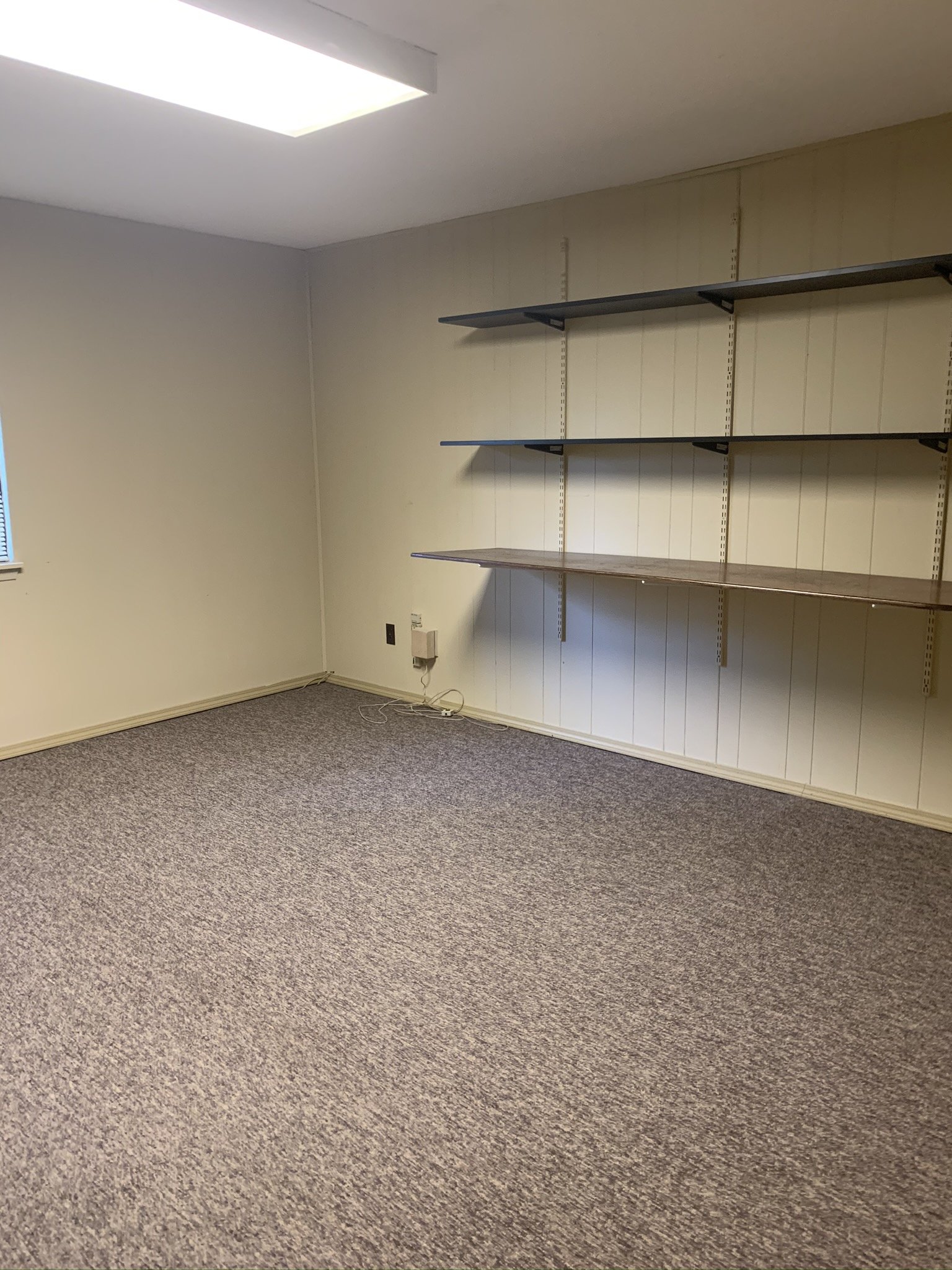
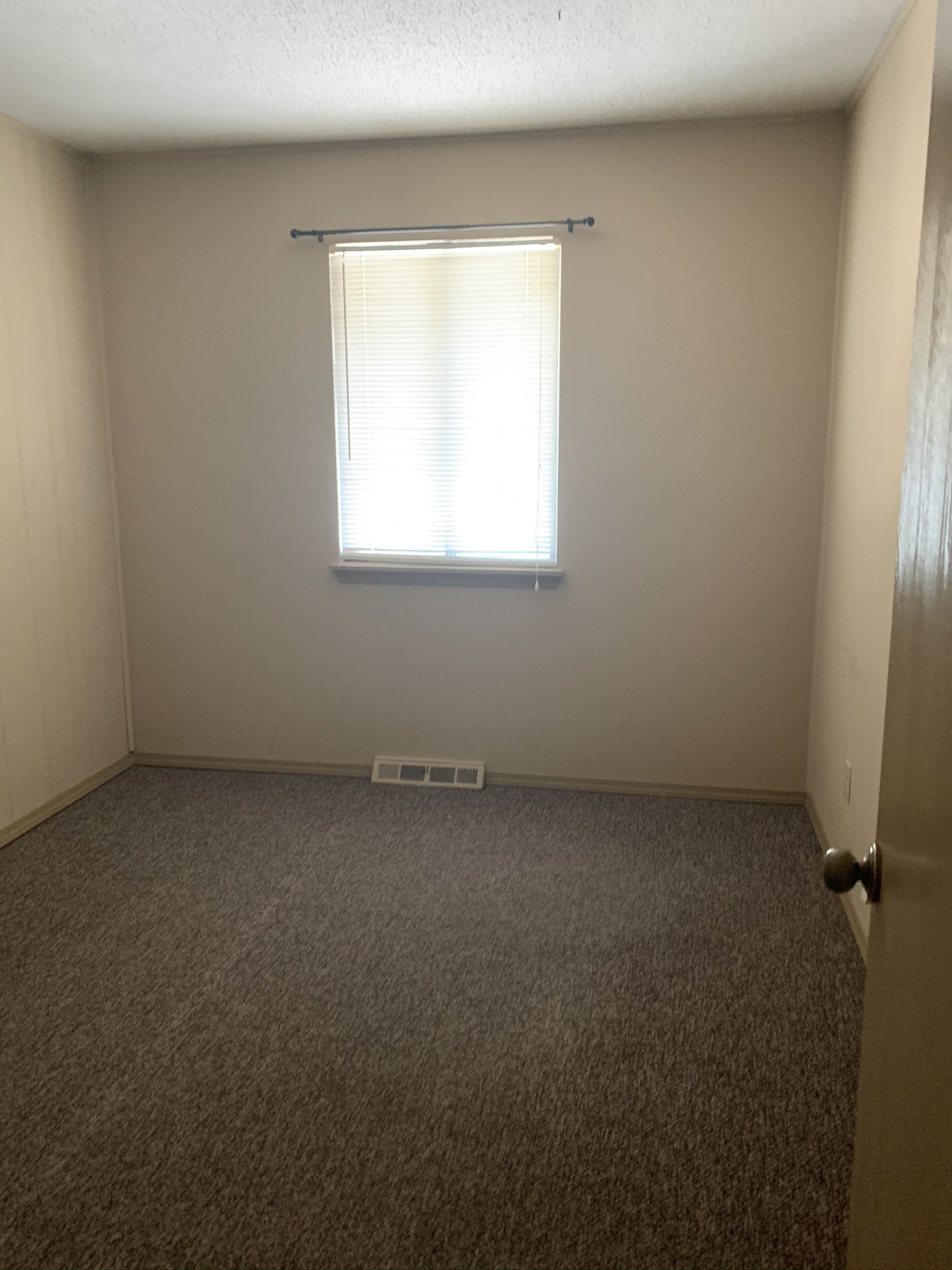
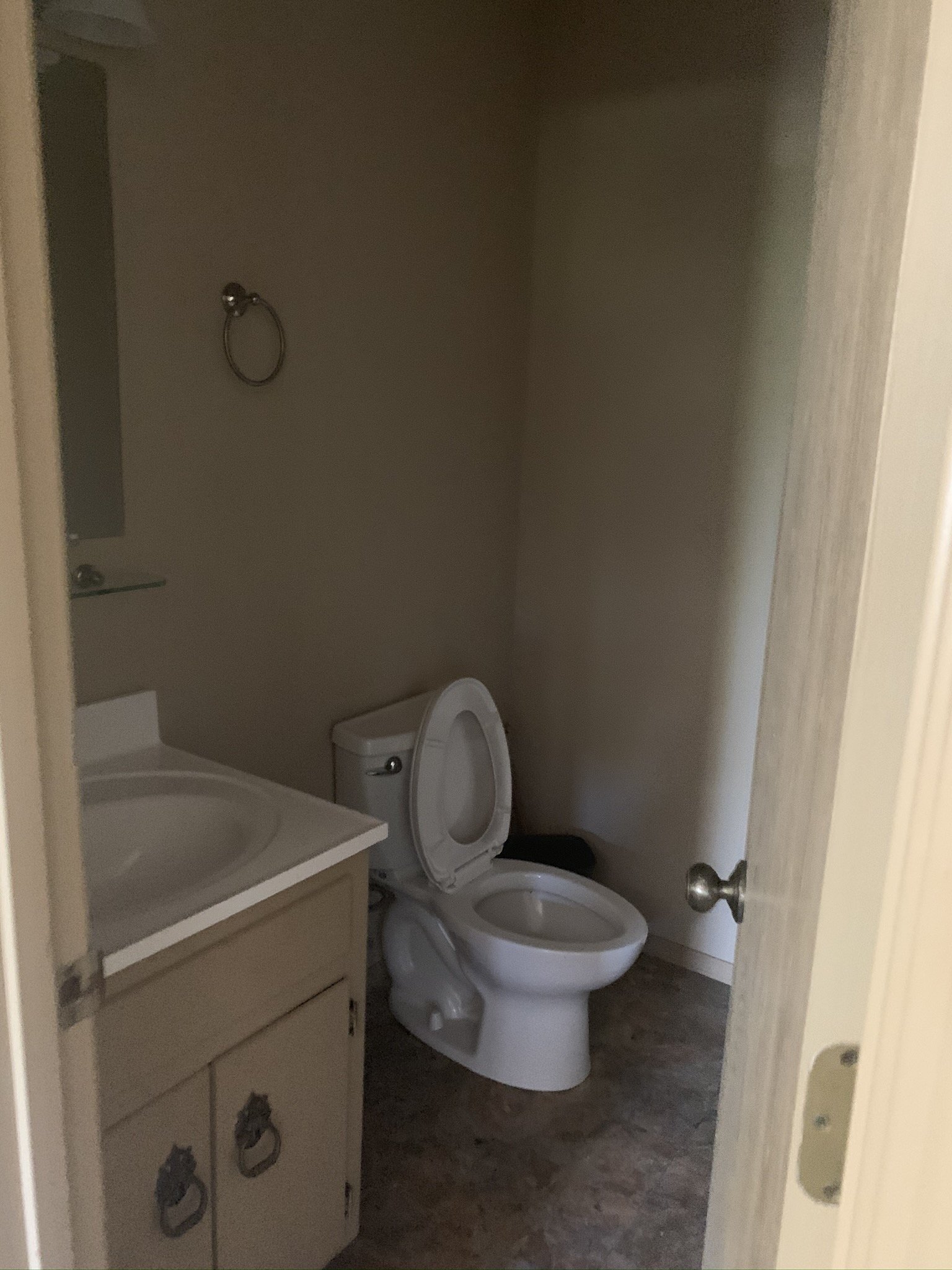
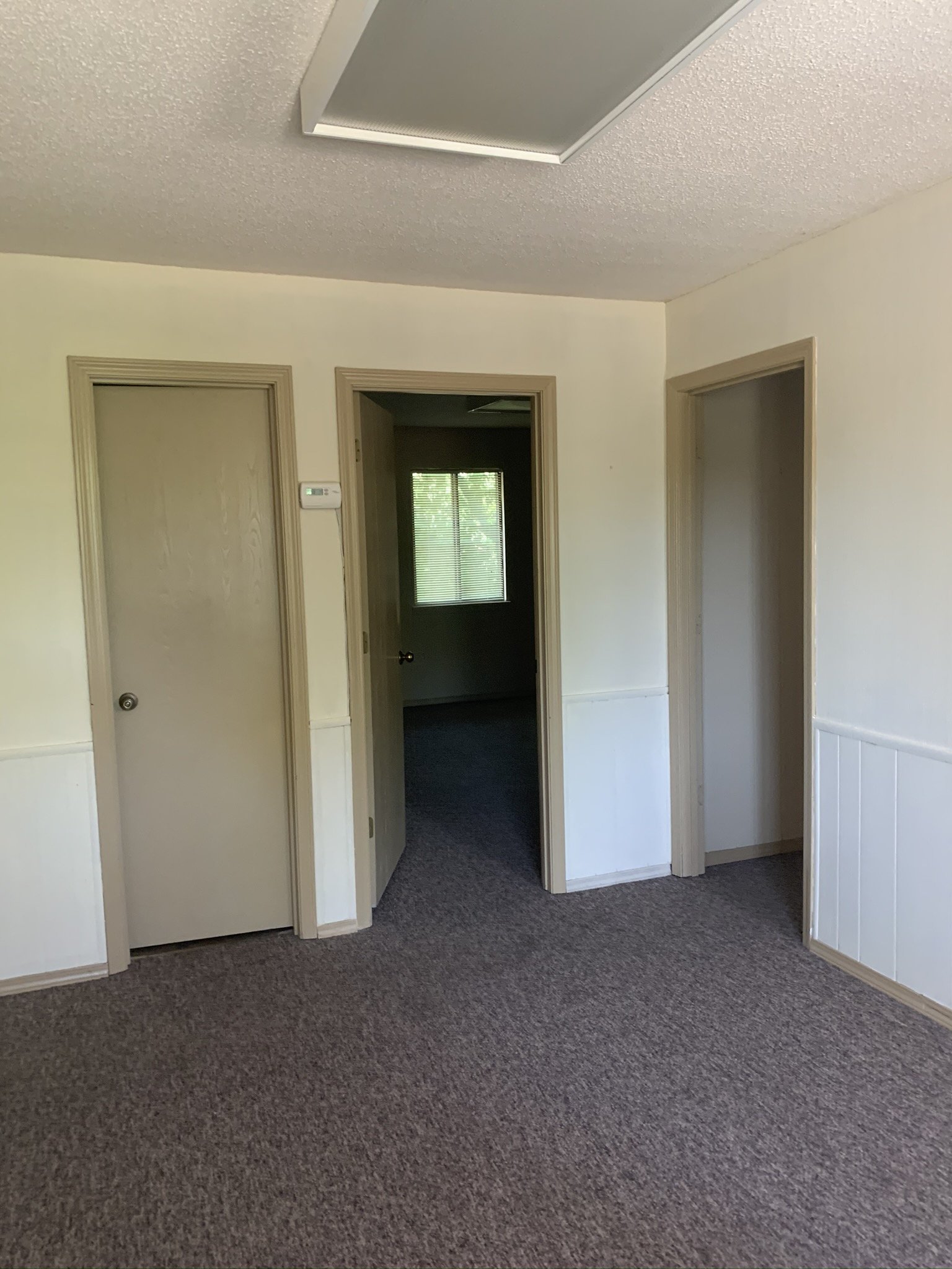
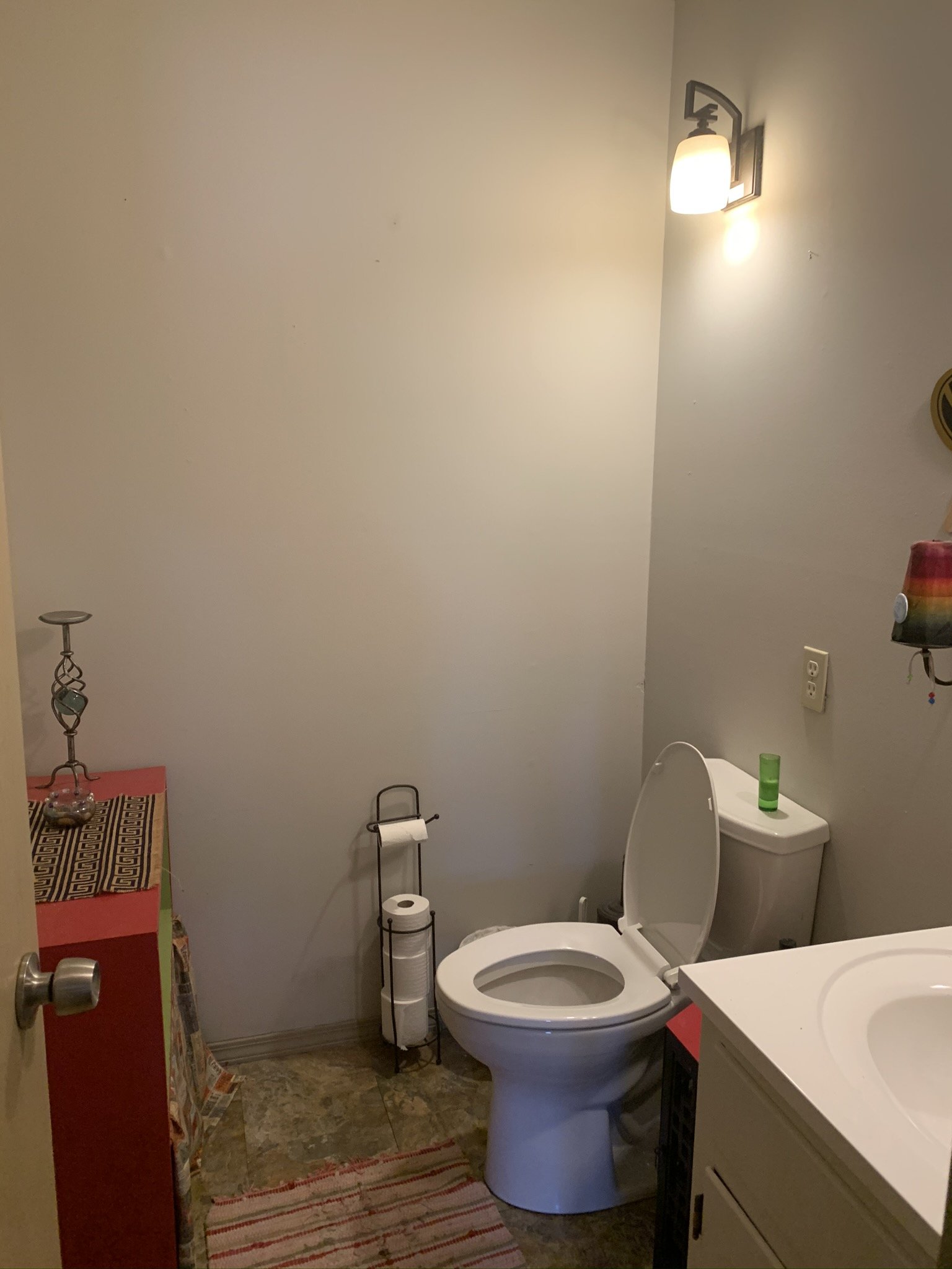
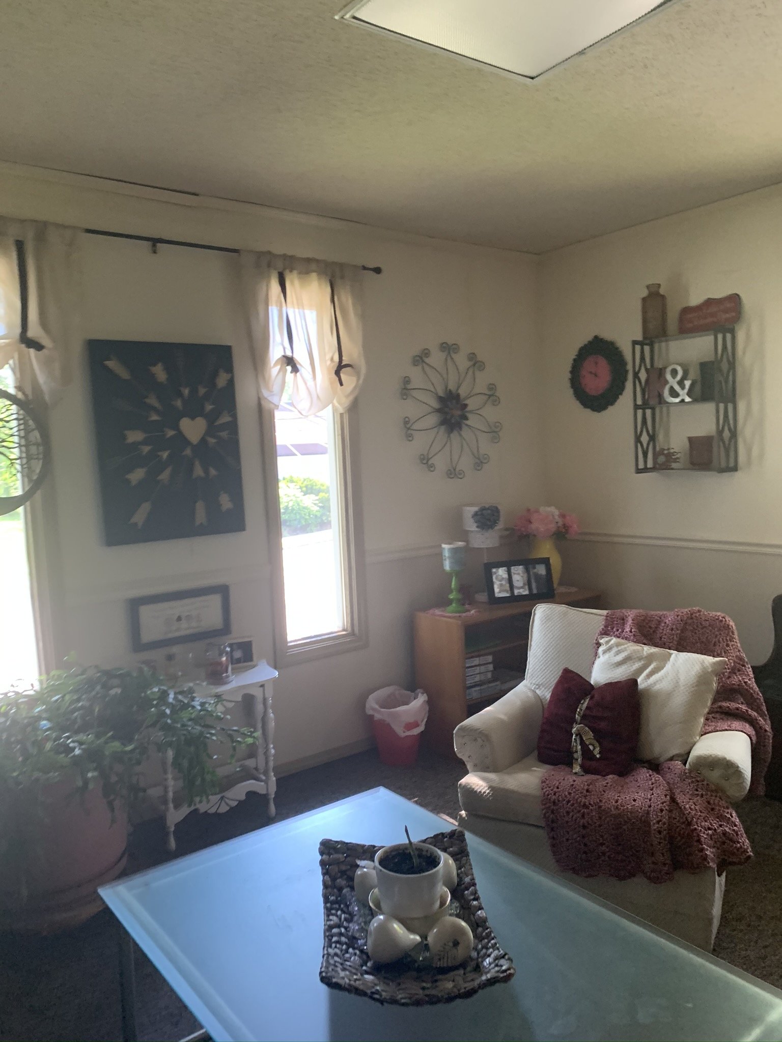
One of the greatest challenges was transforming the awkward layout of the building into Hoot’s dream office. One of our favorite things to do is take a layout that isn’t working and re-work it to meet all of our clients’ needs and wants. This one took some creative space planning and we were thrilled to be able to design something bold, fun, feminine, and multi-functional for this team within budget and on time.
BEFORE:
Showcasing our Skills
As a client-focused firm, we specialize in coming up with creative solutions on the job site, styling and accessorizing for a fully finished feel, mixing materials, and bringing warmth into the space. For this project, we also got to play with bold colors and patterns, which was a lot of fun given we normally work with a lot of neutrals.
We absolutely loved being a part of designing a space that perfectly fits the needs of each member of this team, with room to grow in the future. From the custom copper backsplash to the gorgeous marble bathroom tile to the sleek black windows and modern curve details, this space is designed to inspire this thriving team for a long, long time.
Credits
Spillman Homes
Builder
Artisans of Wood
Cabinetry
Adrienne Luther
Bathroom Wall Artist
Emily Sewell
Photography

